
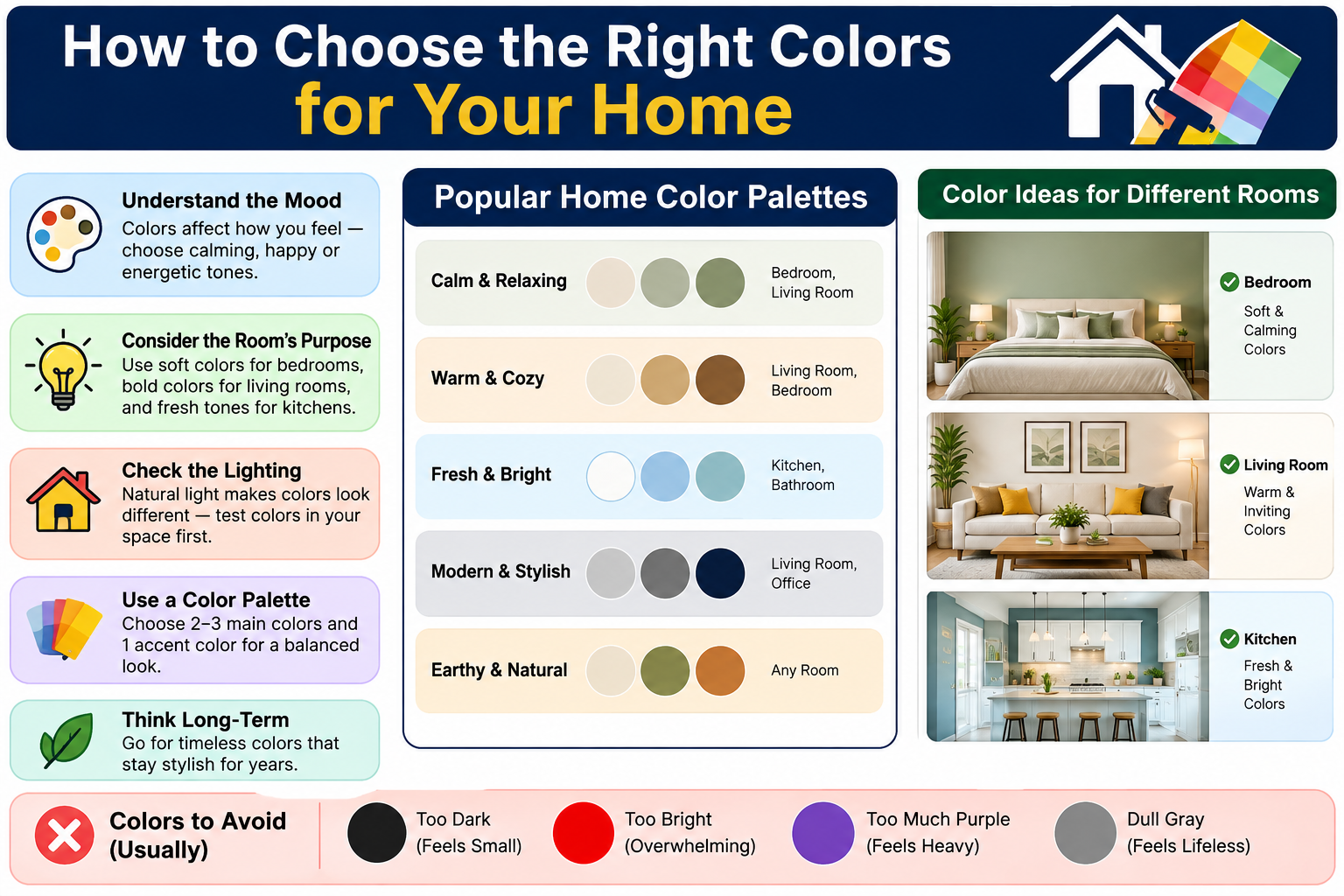
How to Choose the Right Colors for Your Home

Introduction
Choosing colors for a home involves considerably more than picking shades you find attractive in a paint store. A color that looks perfect on a chip under a store’s lighting may behave completely differently on a full wall in your actual room. A shade that photographs beautifully online may feel flat, cold, or overwhelming in your specific space.
Color in a home works within a system. The wall color exists alongside the flooring, the furniture, the ceiling, the trim, the fixed finishes, and the natural and artificial light in that specific room. Change any one of those elements and the wall color reads differently. This is why colors that work beautifully in someone else’s home sometimes feel wrong in yours, even when you have chosen what appears to be the same shade.
Knowing how to choose the right colors for your home means understanding that system rather than selecting colors in isolation. This guide covers the practical considerations that actually matter, from light direction and room size to furniture coordination, trim choices, and testing colors properly before committing to a full room.
1. Consider Your Home’s Natural Light
Natural light is one of the most important factors in how a paint color reads in a room, and it is one that cannot be compensated for after the paint is on the wall. The direction a room faces, the size of its windows, and how much of the day it receives direct sunlight all affect how colors appear.
North-facing rooms receive indirect, cooler light throughout the day. They do not get direct sunlight, which means the light quality is more constant but generally softer and slightly blue in character. Colors in north-facing rooms can lean cooler and slightly grayer than they appear on a chip. Warm undertones in a paint color help to counteract this quality. Cool grays, blue-greens, and bright whites can sometimes feel flat or slightly cold in a north-facing room that receives limited light.
South-facing rooms receive more direct sunlight for longer portions of the day. This warmer, stronger light makes colors read more vibrantly and brings out the warmth in neutral tones. South-facing rooms have more flexibility in color selection because the light is generous enough to compensate for cool undertones that might be problematic in a north-facing space.
East-facing rooms receive direct morning light that is warm and relatively soft. By afternoon, they rely on indirect light that can feel noticeably cooler. A color that looks lovely in morning light may feel different by mid-afternoon in an east-facing room.
West-facing rooms do the reverse. They can feel slightly flat and cool in the morning and dramatically warm in the late afternoon and evening when direct sun hits. Colors in west-facing rooms need to be assessed across both ends of the day.
The practical implication of all of this is that you cannot fully evaluate a paint color for a specific room without seeing it in that room’s light. A sample painted on the wall and observed at different times of day is an essential step, not an optional one.
2. Think About the Size of the Room
Color can influence how large or enclosed a room feels, though the relationship is more nuanced than the simple claim that light colors make rooms look larger and dark colors make them look smaller.
Lighter colors do tend to reflect more light, which reduces the sense of visual weight on the walls and can make a room feel more open. This works because a lighter wall draws less attention to itself and allows the eye to move through the space more freely.
Contrast within a room is as relevant as the absolute lightness or darkness of the wall color. A room with stark white walls, very dark flooring, and dark furniture has a high level of visual contrast that can actually make the room feel busier and more compressed. A room where the wall color, flooring, and furniture all sit within a related tonal range, even if none of them are particularly light, can feel more cohesive and spacious because the eye is not repeatedly interrupted by contrasting boundaries.
Ceiling color matters in rooms where height is a consideration. Painting the ceiling a shade or two lighter than the walls emphasizes the height of the room by making the ceiling appear to recede. Painting the ceiling the same color as the walls creates a more enveloping, continuous effect that can suit some styles and intentions while making others feel more enclosed.
Darker colors do not automatically make small rooms feel smaller. A small room painted in a deep tone with good lighting, appropriate furniture scale, and limited clutter can feel intimate and cozy in a way that is genuinely appealing. The key is intention. A dark color chosen deliberately for a small space can work well. The same dark color in a poorly lit, cluttered small room does compound the problem.
3. Consider Existing Furniture and Flooring
Most homeowners are not starting from scratch. The flooring was there before any decorating decision was made. The sofa was purchased independently. The kitchen cabinets came with the house. These fixed and semi-fixed elements set the conditions that any new wall color must work within.
Before choosing any paint color, take a clear-eyed inventory of what is already in the room and identify the dominant tones. A room with warm honey-toned wood floors and a cream upholstered sofa has a warm foundation that pairs naturally with warm wall tones. Introducing a cool gray or blue-green in that environment can feel like a tonal mismatch because the wall color and the flooring pull in different directions.
A room with darker flooring and furniture in a darker wood tone has a heavier visual base that can handle medium-toned walls more easily than a room with light wood floors and light furniture.
The undertones in fixed finishes matter as much as their surface color. Many beige floors have either a pink or green undertone. Many wood floors lean either warm orange-red or cooler brown-gray. Many white cabinets are not truly neutral but lean cream, yellow, or slightly blue. Identifying these undertones and coordinating the wall color with them rather than against them produces a more harmonious result.
Tiles in kitchens and bathrooms are particularly relevant because they are expensive to change and their color and finish significantly affect how other colors in the room read. The wall color in a bathroom should coordinate with the tile, not compete with it.
4. Understand Warm and Cool Colors
The warm and cool distinction in color is one of the most practically useful concepts for homeowners selecting paint.
Warm colors sit in the red, orange, yellow, and yellow-green portion of the color spectrum. Their undertones lean toward these hues even when they are lightened to neutrals. A warm beige has a yellow or orange quality beneath its surface. A warm gray leans toward red or brown. A warm white has a cream or yellow quality rather than a blue one.
Cool colors sit in the blue, green, and blue-violet portion of the spectrum. Cool grays lean blue or purple. Cool whites lean slightly blue. Cool greens lean toward blue rather than yellow.
Both warm and cool colors have their place in interiors, and neither is universally preferable. The question is whether the specific warm or cool tone works with the light available and the other materials present.
Warm colors tend to create a more enveloping, comfortable atmosphere and pair naturally with warm wood tones, warm stone, cream, and similar materials. They can feel welcoming in rooms where atmosphere matters, living rooms, dining rooms, and bedrooms.
Cool colors tend to feel fresher, sometimes more restful, and can work very well in rooms with good natural light where the coolness does not become flatness. They can pair beautifully with white, chrome, cool stone, and similarly cool-toned materials.
The most common problem is choosing a cool wall color without recognizing that the existing floors and furniture are warm, or choosing a warm wall color that fights against distinctly cool fixed finishes. The result is a room that looks visually unsettled without an obvious reason.
5. Build a Simple Whole-Home Color Palette
A home where colors are chosen room by room, without reference to the connecting spaces or overall palette, tends to feel disjointed when moving through it. This does not mean every room needs to be the same color. It means there should be enough visual connection between spaces to make the home feel coherent.
A practical approach is to establish a main neutral that works throughout most of the home, on hallways, ceilings, trim, and as a base for the rooms where the primary color will be used. This neutral should be tested against the flooring and other fixed finishes throughout the home to ensure it reads consistently well in different light conditions.
From the main neutral, individual rooms can introduce their own character through a wall color that shares enough tonal DNA with the neutral to feel related. A home with a warm cream as its main neutral might have a soft sage living room, a pale terracotta study, and a warm gray blue bedroom. None of these is identical, but they all sit within a warm-to-neutral tonal family and move between them without a jarring shift.
Accent colors, the colors introduced in cushions, artwork, rugs, and accessories, can be more distinctive and personal because they are not fixed. They can also be repeated in small quantities across different rooms to create a thread of visual continuity without the rooms being matched.
Hallways and open transitions between rooms are the most critical places to consider carefully in whole-home color planning. Because they are simultaneously part of two or more spaces, the colors need to feel compatible in both directions.
6. Choose Colors Based on How Each Room Is Used
The function of a room is worth considering when choosing its color because color can contribute to or work against the atmosphere a room needs.
Rooms intended for rest and sleep, bedrooms in particular, often benefit from colors that feel calm and settled. Cooler, muted tones can feel restful in a bedroom, as can warm neutrals and soft earthy shades. Very stimulating colors, bright saturated reds, electric blues, vibrant yellows, can be more difficult to relax in, though personal preference has a significant role here.
Rooms intended for work or study sometimes suit colors that feel clear and organized rather than heavy or overly warm. A lighter tone with some cool quality can keep the space feeling alert. A very warm, rich color might create an atmosphere that is pleasant but not necessarily conducive to sustained concentration.
Kitchens used actively for cooking often benefit from a color that feels energizing and clean. The color needs to coordinate strongly with the cabinets, countertops, and backsplash. Rooms used primarily for entertaining or relaxing, living rooms and dining rooms, can carry colors with more character and warmth because the atmosphere is a significant part of their purpose.
Children’s rooms can accommodate more playful colors, though it is worth considering that children grow and their preferences change. A room painted in a more flexible base color with colorful accessories can adapt more easily than one painted in a very specific, strong color.
7. Choosing Colors for the Living Room
The living room typically accommodates a range of activities, conversation, relaxing, watching television, reading, sometimes hosting, and its color needs to work across all of them throughout the day and evening.
Start by identifying the dominant tones already present. The sofa fabric, the flooring tone, the curtain color, and any significant furniture all set the framework within which the wall color needs to work. If the sofa is a warm taupe and the floor is a mid-warm wood, the wall color has a warm foundation to build from.
Lighting conditions throughout the day should inform the tone chosen. A living room that receives morning sun and evening artificial light needs a color that reads well in both. Testing a sample on the wall and observing it at different hours, morning, midday, evening with lamps on, is the most reliable way to assess this.
Medium-toned walls work well in many living rooms because they provide enough presence to feel considered without the commitment of a dark color. A soft sage, a muted olive, a warm greige, or a dusty blue each create a different atmosphere that suits different furniture palettes and personal styles.
The living room is also a room where a bolder approach can work when the room is well-lit and the furniture palette is sufficiently neutral to let the wall color play a stronger role. A deep teal, a warm terracotta, or a rich earthy green can create a genuinely beautiful living room when the other elements support it.
8. Choosing Colors for the Bedroom
Bedrooms are the rooms where most homeowners have the most freedom to choose a color they personally love because the space is private and its purpose supports a wide range of color choices. The main practical consideration is that the color should contribute to, rather than work against, the restful purpose of the room.
Soft, muted versions of most colors tend to work better in bedrooms than bright, saturated versions of the same hue. A muted sage is generally easier to sleep in than a vibrant emerald. A dusty blue is more restful than a bright cobalt. Warmth in the undertone helps the room feel welcoming in the morning and settled in the evening.
The bedding, curtains, and rug in a bedroom contribute significantly to how the wall color reads, often more so than in other rooms because the bed itself occupies such a large visual portion of the space. Testing the wall color alongside the planned or existing bedding colors avoids the common situation of choosing a wall color independently and then finding that the bedding creates a conflict.
Where a bedroom has limited natural light, warm tones tend to compensate better than cool ones. Where the room receives good morning sun, a wider range of colors is workable.
Personal preference matters considerably here. The bedroom is one room where the first criterion can genuinely be what the person who sleeps there finds calming and comfortable. The practical considerations help narrow the field, but the final choice should feel right to the person using the room every day.
9. Choosing Colors for the Kitchen
Kitchen color selection is more constrained than most other rooms because the cabinets, countertops, backsplash, flooring, and appliances set such a significant portion of the room’s color and tone. The wall color, in most kitchens, covers a relatively small proportion of the visible surface and needs to coordinate with a large number of fixed elements.
Start by identifying the dominant undertone in the cabinets and countertops. White cabinets with a cream or yellow undertone pair naturally with warm wall tones. White cabinets with a blue undertone sit more comfortably with cooler tones. Medium wood cabinets with an orange undertone pair well with warm neutrals, greens with warm yellow qualities, and similar warm companions.
Backsplash tile is often the element with the most distinctive color and pattern in a kitchen, and the wall color should be evaluated against it carefully. A backsplash with cool gray tones is difficult to pair with a strongly warm wall color.
Kitchens with limited natural light benefit from lighter wall tones that reflect what light is available. Kitchens with good natural light can carry mid-tones with more confidence.
For practical, inspiring ideas on how paint color works alongside kitchen updates, our guide on how to make your home look more modern covers the kitchen as part of a broader interior refresh, including how color interacts with cabinet hardware, lighting, and surface materials.
10. Choosing Colors for the Bathroom
Bathrooms present a specific color challenge. They are typically small, often have limited or no natural light, are dominated by fixed elements like tile and fixtures, and are used for brief functional purposes rather than extended relaxation.
The tile is usually the starting point. Whatever its color, the wall color needs to coordinate with it without either matching too closely, which can look flat, or contrasting too strongly, which can create a jarring effect in a small space.
Artificial lighting quality in a bathroom significantly affects how colors read. A bathroom with warm artificial light makes most colors lean warmer and slightly more flattering. Cool overhead lighting can make colors lean grayer and less pleasant. The wall color should ideally be assessed under the bathroom’s actual lighting conditions rather than in a showroom or against a chip in daylight.
Lighter colors are practical in small bathrooms without natural light because they reflect what artificial light is available and prevent the room from feeling even more enclosed. In a bathroom with a window and reasonable natural light, a wider range is workable.
Soft green, warm white, pale blue-gray, soft terracotta, and muted sage are all colors that appear frequently in well-designed bathrooms because they suit the materials common to bathroom environments without feeling either too clinical or too heavy.
11. Choosing Colors for Small Rooms
Small rooms can be approached in two quite different ways, and both can produce successful results. The conventional approach is to use lighter colors that reflect more light and create less visual compression. The less conventional approach is to lean into the small scale with a deeper, more enveloping color that makes the room feel deliberately intimate rather than accidentally cramped.
The lighter approach works by reducing the visual weight of the walls so the eye perceives the space as having more room. Consistent tones, where the walls, ceiling, and trim are all in related shades rather than high contrast, remove the visual boundaries that make a room feel more boxed-in. A small room with white walls, white ceiling, and white or very pale trim has no visual interruption that emphasizes its limits.
The darker approach works when the room is treated as a deliberate jewel box. A small study, a bathroom, a walk-in wardrobe, or a compact dining room painted in a deep, rich color can feel beautiful and intentional when the lighting is appropriate, the furniture is scaled correctly, and the decision is made with confidence rather than compromise. The room does not feel larger, but it stops feeling accidentally small and instead feels deliberately cozy.
Lighting quality is critical in any small room regardless of the color approach taken. A small room with inadequate lighting will feel uncomfortable in any color. A small room with good layered lighting can support a much wider range of color choices than a poorly lit room of the same dimensions.
12. Choosing Colors for Large or Open-Plan Spaces
Large rooms and open-plan spaces present a different set of challenges. A single paint color across a very large wall area can feel overwhelming or monotonous. Multiple disconnected colors in an open-plan space can make it feel fragmented.
In an open-plan kitchen and living space, using the same or closely related color throughout the combined area creates a sense of visual continuity that makes the overall space feel cohesive and expansive. Introducing a strongly contrasting color in one part of the combined space can create an awkward visual break that emphasizes the division rather than the connection.
Defining different functional areas within an open-plan space through color requires a light touch. A slightly different shade on the wall behind the dining area, or a feature wall that anchors the living room seating arrangement, can create distinction without disruption.
Large rooms with high ceilings can carry deeper or more saturated wall colors more comfortably than small rooms because the volume of the space means the color does not overwhelm. A rich earthy green or a warm terracotta on the walls of a well-proportioned large room can feel beautiful and grounded in a way that the same color in a low-ceilinged small room would not.
Creating a whole-home color plan before starting to paint any room is particularly valuable in homes with open-plan layouts or frequent visual connections between rooms. Our guide on how to improve your home’s interior design covers the principles of visual flow between rooms in more detail, including how color continuity contributes to a home that feels intentionally designed.
13. How to Choose the Right Trim and Ceiling Color
Trim and ceiling colors are treated as secondary decisions in most homes, but they significantly affect how the wall color reads and how the overall room feels proportionally.
White and off-white trim is the most broadly used approach because it provides a clean boundary between the wall and the architectural elements without creating strong competition. The specific white matters. A warm off-white trim against a warm wall color looks cohesive. A bright cool white trim against a warm wall color can create a slightly jarring contrast that emphasizes the distinction between the elements more than is typically desirable.
Matching the trim to the wall color creates a more contemporary, less traditional look and removes the visual interruption of a contrasting boundary at the edges of the room. This approach tends to feel more modern and can work well in rooms where a cleaner, less articulated look suits the architecture.
Contrasting trim, darker than the walls, is a bolder choice that can work very well in rooms with interesting architectural detail. It emphasizes the shape of the room’s architecture, including door frames, window reveals, baseboards, and crown molding, and creates a more formal or character-rich appearance.
Ceilings in most rooms are painted white or a very pale version of the wall color. A true white ceiling tends to feel slightly stark against warm mid-toned walls. A ceiling painted in a very light version of the wall color, or in a warm off-white, looks more intentional and related. Painting the ceiling the same color as the walls creates an enveloping effect that can suit some rooms while making others feel more enclosed.
14. Test Paint Colors Before Committing
Testing paint colors properly before committing to a full room is the single most important practical step in the entire color selection process, and it is one that a significant number of homeowners skip in favor of deciding from a chip or an online image.
Paint chips are useful for comparing colors and narrowing down options, but they show a very small area of color that does not accurately represent how that same color looks across a full wall in a specific room’s lighting conditions. Online images add another layer of distortion because screen settings, photography lighting, and post-processing all alter how colors appear.
The most reliable approach is to paint a generous sample directly on the wall. Some paint brands offer small sample pots specifically for this purpose. Paint the sample in a patch that is large enough to observe properly, at least a foot square, and ideally in more than one location in the room so you can see how it reads near the window and in a shadier corner.
Observe the sample at different times of day. First thing in the morning under whatever natural light the room receives. Midday. In the afternoon. And in the evening under the artificial lighting you normally use. It is not unusual for a color to look quite different between these observations, and seeing those differences before committing to the full room prevents expensive dissatisfaction.
Compare the sample against the fixed finishes it will live alongside. Hold a sample of the flooring, or observe the painted sample from the position where both the wall and the flooring are visible simultaneously. The same for fabric swatches from existing furniture.
15. Common Color Selection Mistakes
Choosing paint before considering flooring and furniture is among the most common and most consequential errors. Wall color needs to work within the context of what already exists in the room. Selecting it without that context frequently produces a result that feels disconnected from the space.
Using too many unrelated colors in a home creates a disjointed, unsettled quality when moving through the rooms. Color variety within a home is desirable, but the variety should exist within a related family rather than as a collection of independent decisions.
Ignoring natural light leads to colors that behave very differently on the wall than they appeared in the store or online. The same color can read completely differently in a north-facing bedroom and a south-facing living room.
Selecting colors only from small chips or online images without testing them in the actual room is a reliable path to disappointment. The color needs to be seen at size, on the actual wall, in the actual lighting.
Using excessive contrast between walls, trim, and ceiling can make a room feel busy and architecturally fractured rather than considered. High contrast works in some specific contexts but is often applied too broadly.
Following trends without considering the home’s architecture and existing materials produces rooms that may look current for a season and then feel dated because the trend color did not genuinely suit the space.
Painting every room without considering how spaces connect creates a home that feels like a series of separate decorating decisions rather than a considered whole.
16. Choosing Colors on Different Budgets
Improving a home’s color scheme does not require repainting every room. A targeted approach that prioritizes the highest-impact changes and works within a realistic budget often produces better results than attempting to do everything at once.
Low-Cost Approaches
The most accessible color improvement is repainting the main living area and any rooms visible from the entry. These spaces have the most influence on the home’s overall impression. Choosing a cohesive neutral for these spaces that is noticeably better than the existing paint immediately improves how the whole home feels.
Updating accent colors through cushions, throws, curtains, and accessories changes the color story of a room without touching the walls. This is particularly useful in rooms where the existing wall color is acceptable but the accessories have become dated or mismatched.
Moderate Updates
Repainting the main living room, hallways, and one or two bedrooms is a significant but manageable investment. Choosing a palette before starting ensures the rooms work together once they are all refreshed.
Adding a different color to one room, a bedroom in a distinctive shade while the rest of the home uses a cohesive neutral, creates variety within a coordinated scheme.
Larger Color-Focused Improvements
A full interior repaint provides the opportunity to establish a cohesive palette throughout the home. This is particularly valuable in homes where previous occupants or previous decorating decisions have left a disconnected collection of colors.
Exterior painting can significantly improve the home’s first impression and coordinate the exterior with the surrounding architecture and neighboring properties. Exterior color selection involves additional considerations including neighborhood character, material compatibility, and durability of the chosen paint for outdoor conditions.
17. How to Create a Balanced Color Scheme
A balanced color scheme is not a matched color scheme. Rooms where every element is an exact match feel flat and overly coordinated rather than harmonious. Balance comes from a deliberate relationship between the different colors used, in terms of their proportion, their visual weight, and their tonal relationship.
The simplest useful framework is thinking in terms of three layers. The dominant color covers the largest surface area, usually the walls. The secondary color appears in the larger furniture pieces, flooring, and major soft furnishings like curtains and the main sofa. The accent color appears in the smaller, more changeable elements, cushions, artwork, plants, vases, throws, and similar accessories.
In most rooms, these three layers should sit within a related tonal family rather than being selected independently. A room with warm-toned walls, warm-toned wood floor, and warm-neutral upholstery creates a harmonious dominant and secondary layer that an accent color can build on. The accent color can introduce something different without the contrast feeling jarring because the base is cohesive.
Contrast within a balanced scheme comes from differences in value (lightness and darkness), texture, and material character rather than from fundamentally opposing colors. A room with all elements in the same mid-tone feels flat. Adding lighter and darker variations of the same tonal family creates depth without discord.
For anyone interested in understanding how color works alongside other interior design decisions, our guide on best home improvement ideas for a cozy home covers warm color choices, lighting, and textiles in detail, which are closely connected to the color principles discussed here.
Frequently Asked Questions
How do I choose the best color for my living room?
Start by identifying the dominant tones already present in the room’s fixed elements, the flooring, the sofa, and any significant furniture. The wall color needs to coordinate with these rather than compete with them. Then consider the natural light quality: whether the room faces north, south, east, or west affects how any color reads throughout the day. Test a generous paint sample on the wall and observe it at different times, including in the evening under your artificial lighting, before committing. A color that works consistently throughout the day is a more reliable choice than one that only looks right at one time.
What colors make a small room feel larger?
Lighter colors reflect more light and can reduce the visual compression a small room creates. Consistent tones across walls, ceiling, and trim remove the visual interruptions that make a room feel more bounded. Reducing contrast between elements is often as effective as choosing a specific shade. That said, a well-lit small room painted in a confident deeper color can feel intentionally intimate rather than accidentally cramped. The lighting quality in the room and the overall intention behind the color choice matter as much as the specific shade selected.
Should every room in a house be the same color?
No, but they should be related enough that moving through the home does not feel like a series of disconnected decorating decisions. A practical approach is to choose a cohesive main neutral for hallways and connecting spaces, and allow individual rooms to have their own character within a palette that shares enough tonal DNA to feel related. Adjacent rooms that are visible from one another need to be considered together. Rooms that are physically separated can carry more independent character.
How many colors should I use in one room?
The most workable framework is one dominant color, one secondary color, and one or two accent colors. This does not mean rigid limitations, but it provides a practical guideline for keeping a room visually settled. A room with too many competing colors in similar proportions rarely feels harmonious. Concentrating variety in the smallest, most changeable elements, accessories, cushions, and artwork, keeps the room flexible without creating visual confusion.
How do I choose paint colors that match my furniture?
Identify the underlying undertone of the dominant furniture pieces rather than their surface color. A sofa described as gray may have warm pink undertones or cool blue undertones. A wood floor described as brown may lean warm orange or cooler taupe. The wall color should share or complement these undertones rather than pull against them. Hold paint samples against the furniture in the room’s actual lighting conditions rather than relying on online comparisons, because screens display colors differently than the materials read in person.
Should trim be lighter or darker than the walls?
In most cases, trim is painted lighter than the walls, usually in white or off-white, which creates a clean definition of the room’s architectural boundaries. Whether that trim white should be a warm or cool tone depends on the warmth of the wall color. Warm wall colors generally pair better with warm off-white trim than with a stark cool white. Trim the same color as the walls creates a more contemporary, less articulated look that works well in some architectural styles. Darker trim than the walls is a deliberate and bold choice that emphasizes architectural detail and can look striking when done intentionally.
How can I test a paint color before painting the whole room?
Purchase a small sample pot of the color and paint a patch directly on the wall, large enough to observe clearly, at least a foot square. Paint it in more than one location in the room if possible, near the window and in a shadier area. Observe the sample at different times of day, including morning natural light, midday, and evening under your usual artificial lighting. Compare it against the flooring and any existing furniture or fixed finishes. If you are choosing between two or three options, paint them side by side on the same wall rather than on separate walls, where the different background conditions can make comparison unreliable.
Are neutral colors always the safest choice?
Neutral colors are broadly versatile and coordinate easily with most furniture and flooring combinations, which makes them popular and practical. They also date less visibly than strongly trend-driven choices. However, neutral does not mean inherently correct for every room or every homeowner. A room painted in a color that genuinely reflects the personality of the people living in it and suits the room’s architecture and light is more successful than the same room painted in a safe neutral that nobody particularly loves. The best color for a room is the one that works with the space’s conditions and feels right to live with every day.
Final Thoughts
Knowing how to choose the right colors for your home is ultimately about understanding the system that color works within rather than selecting shades in isolation. The wall color you choose exists alongside the natural light direction, the flooring, the furniture, the fixed finishes, the ceiling, the trim, and the connecting rooms. It looks different in the morning than in the evening. It reads differently in artificial light than in daylight. It influences and is influenced by everything else in the room.
The practical steps that make the most difference are also the most straightforward. Identify what is already in the room before choosing the wall color. Understand the direction the room faces and how that affects light quality. Test samples on the actual wall at different times of day. Observe colors alongside the existing finishes rather than evaluating them in isolation. Build a palette that creates cohesion across the home rather than selecting each room independently.
Personal preference has a genuine role in this process. Color in a home is not purely a technical exercise. The rooms you live in should feel right to you, not just be technically correct by some external measure. The practical principles help narrow the field and avoid the most common mistakes. Within that framework, the final choices should reflect the home and the people who live in it.
Test colors thoughtfully, assess them honestly, and make decisions based on how they look in your actual space throughout the day. That approach produces more reliable results than any paint chip, online image, or current trend ever will.
For more guidance on making related home improvements alongside your color choices, our article on best home improvement ideas for a fresh new look covers a broader range of practical upgrades, from lighting and hardware to furniture and organization, that work together with a refreshed color scheme to genuinely improve how a home looks and feels.